


DbD partnered with New Jersey State Parks (NJSP) to lead a comprehensive rebranding initiative, uniting over 100 diverse locations under a new identity that celebrates the state’s natural beauty and rich history.
The Challenge
Our team faced the challenge of creating a memorable and versatile brand that could honor the system’s familiar yellow-and-green shield while flipping the script on entrenched perceptions of the nation’s most densely populated state to instead feature New Jersey as “wild” and unexpectedly pristine. With a vast and varied system spanning parks, forests, and historic sites, NJSP needed a cohesive brand that could elevate public awareness, unify messaging, and inspire both residents and visitors.

Discovery, Analysis & Community Engagement
Through immersive site visits, stakeholder interviews, and statewide surveys, DbD discovered the shocking diversity and dedicated generational stewardship that define New Jersey’s parks. This hands-on approach revealed both the logistical realities of implementation and the deep community pride that helped shape the brand’s direction.
Visual
Identity
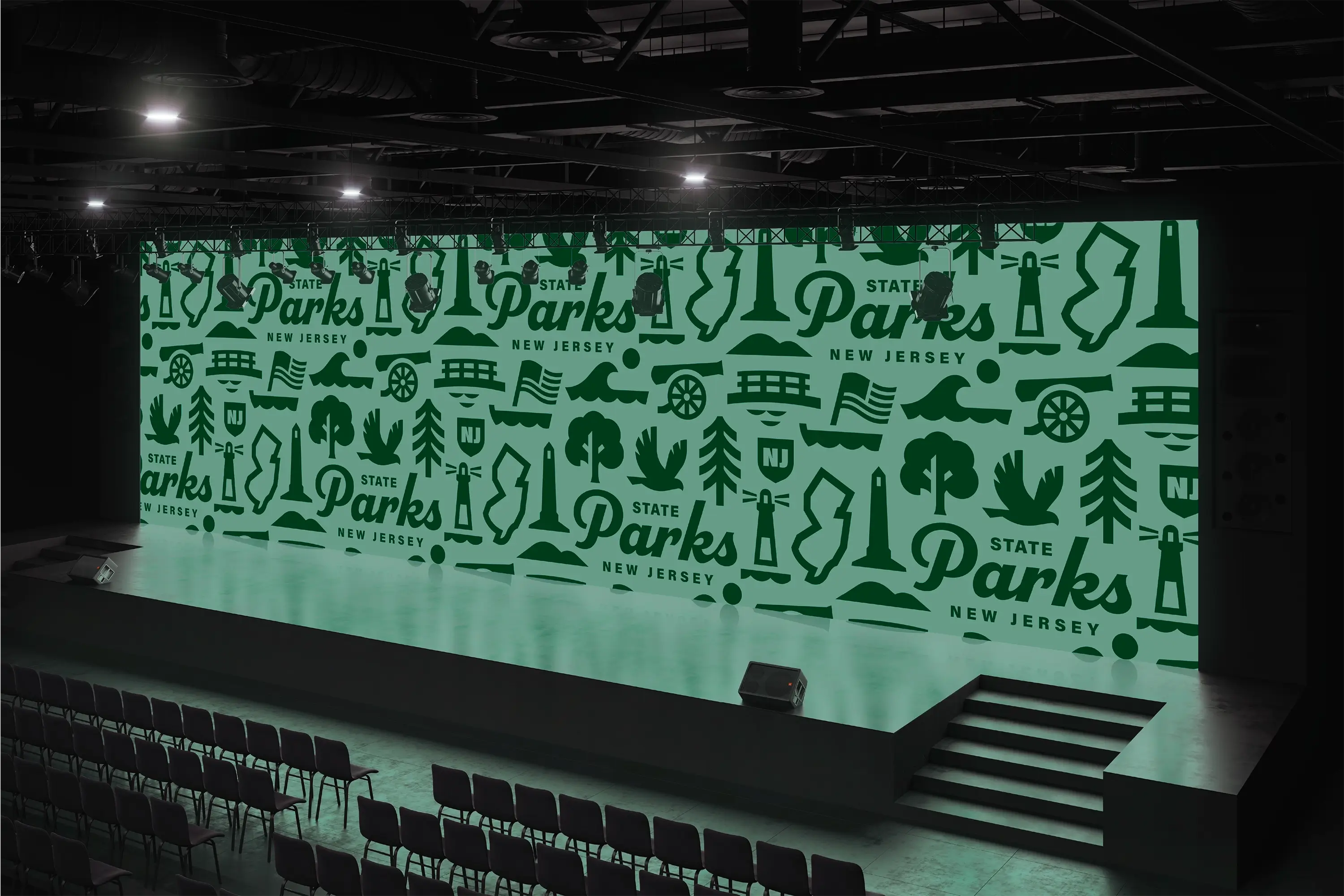
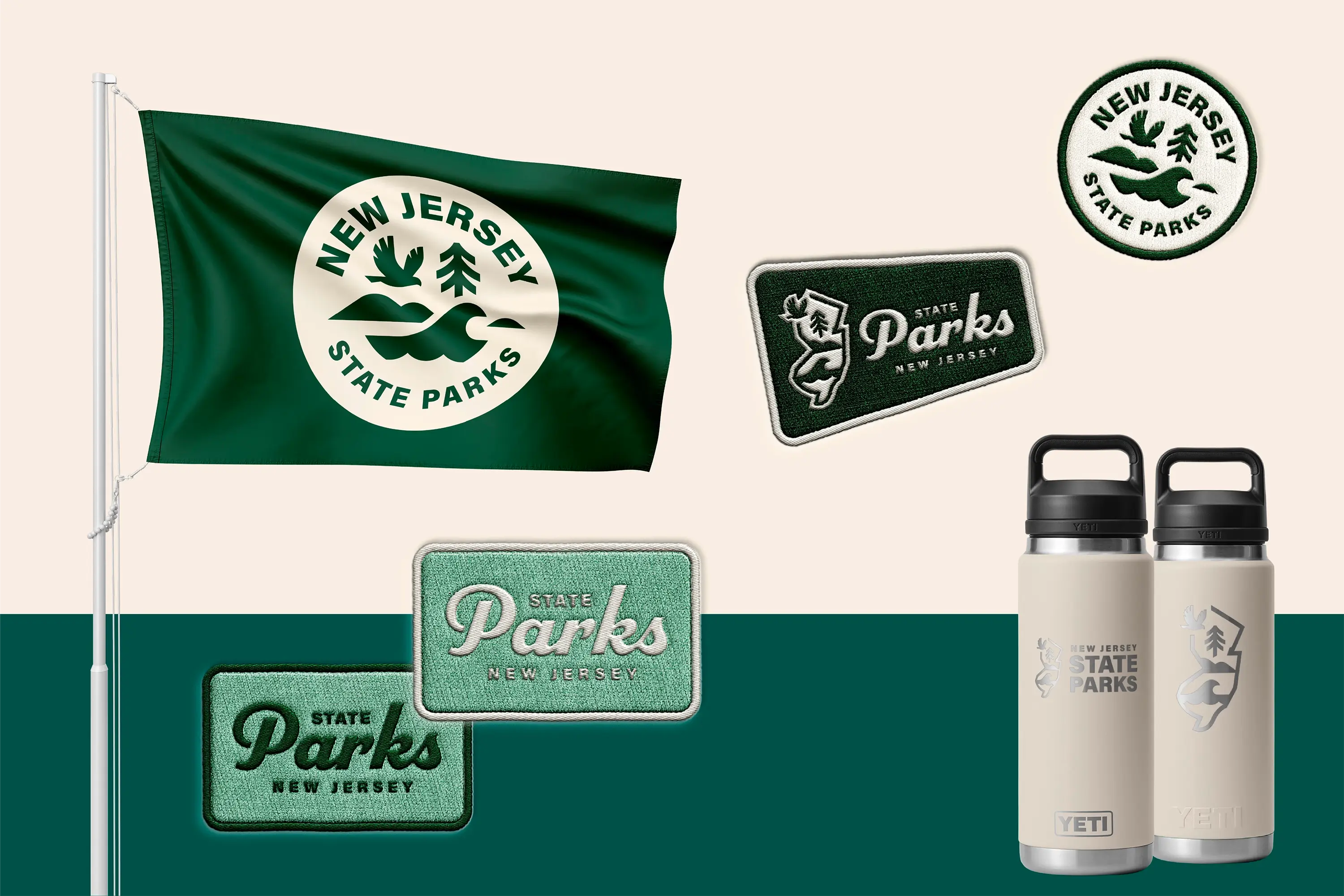
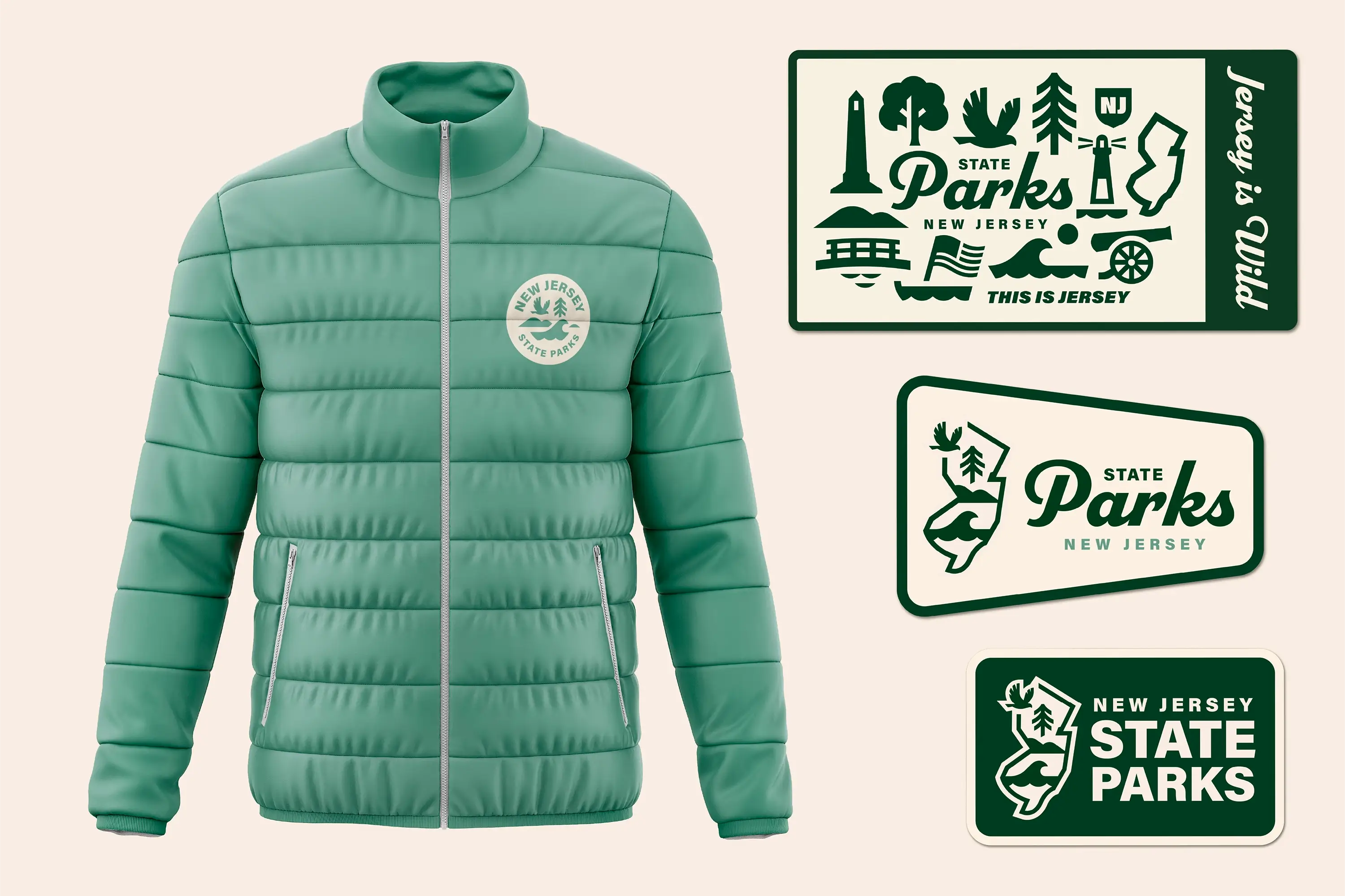
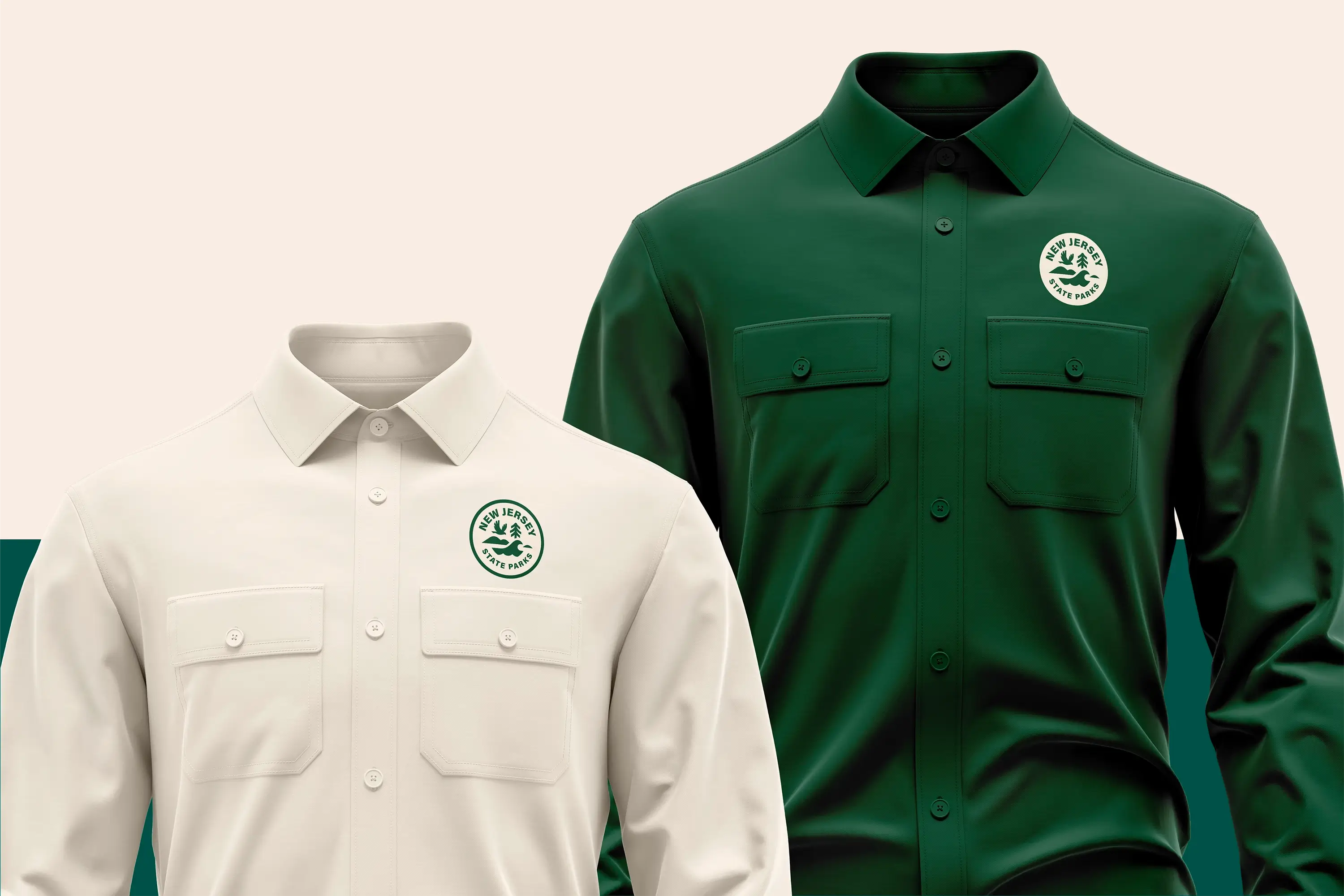
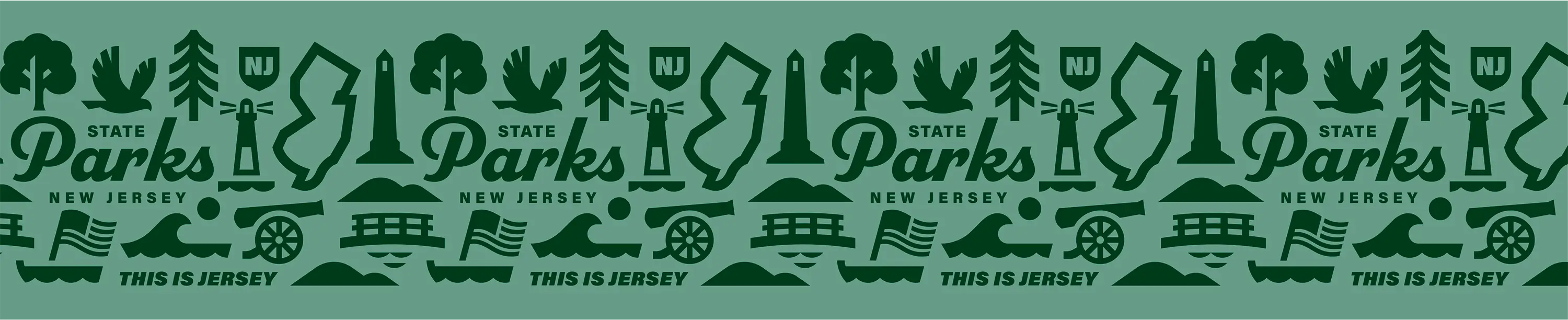
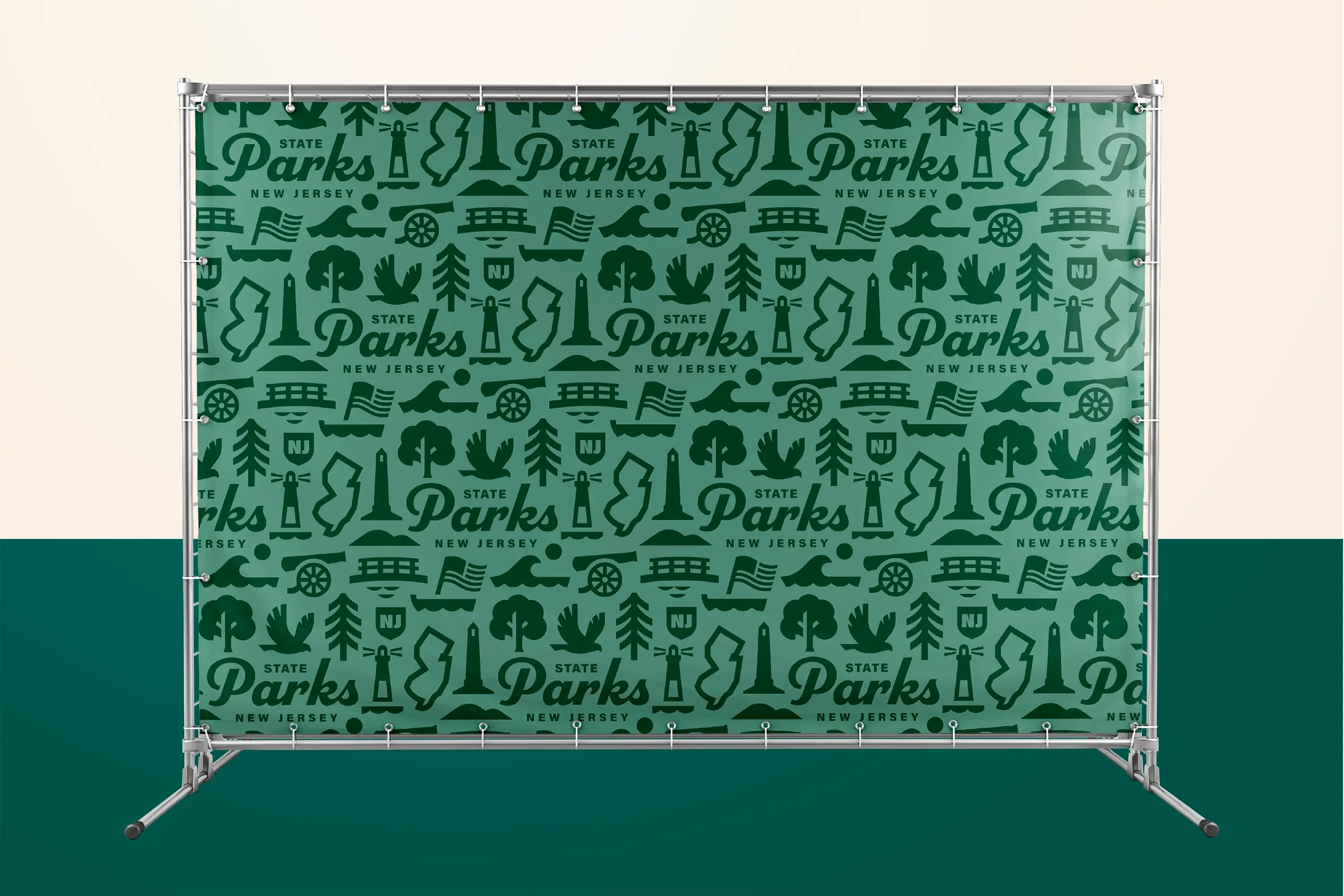
We worked closely with NJSP to refine logo concepts, balancing the desire for a fresh start with the equity of existing symbols, and ultimately crafted a family of brands – each park distinct yet unified by shared fonts, colors, and patterns.
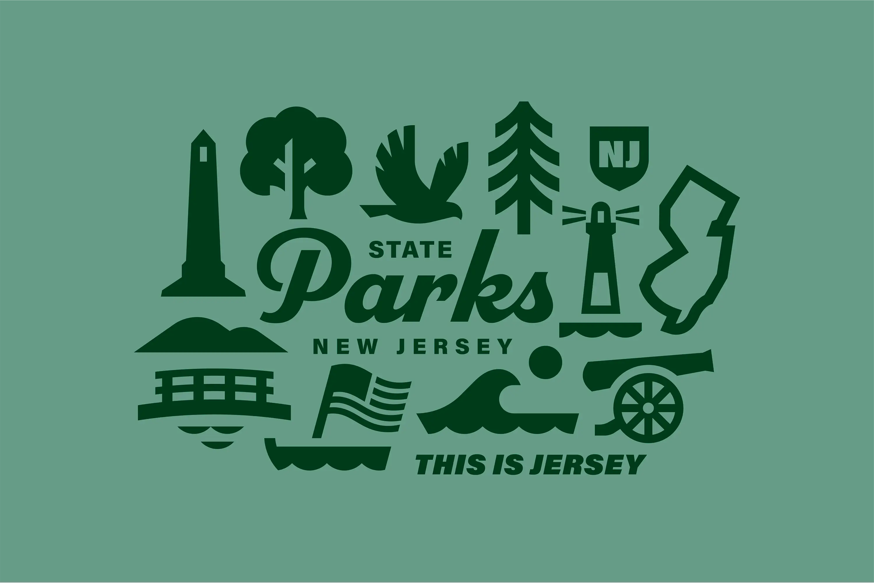
The new visual identity for NJSP brings together wildlife, trees, mountains, and waves into a network of unified marks that symbolize the breadth of New Jersey’s landscapes and the diversity of experiences found within its parks.
Individual
Park Brands

State Historic
Sites Brand
America 250 Brand
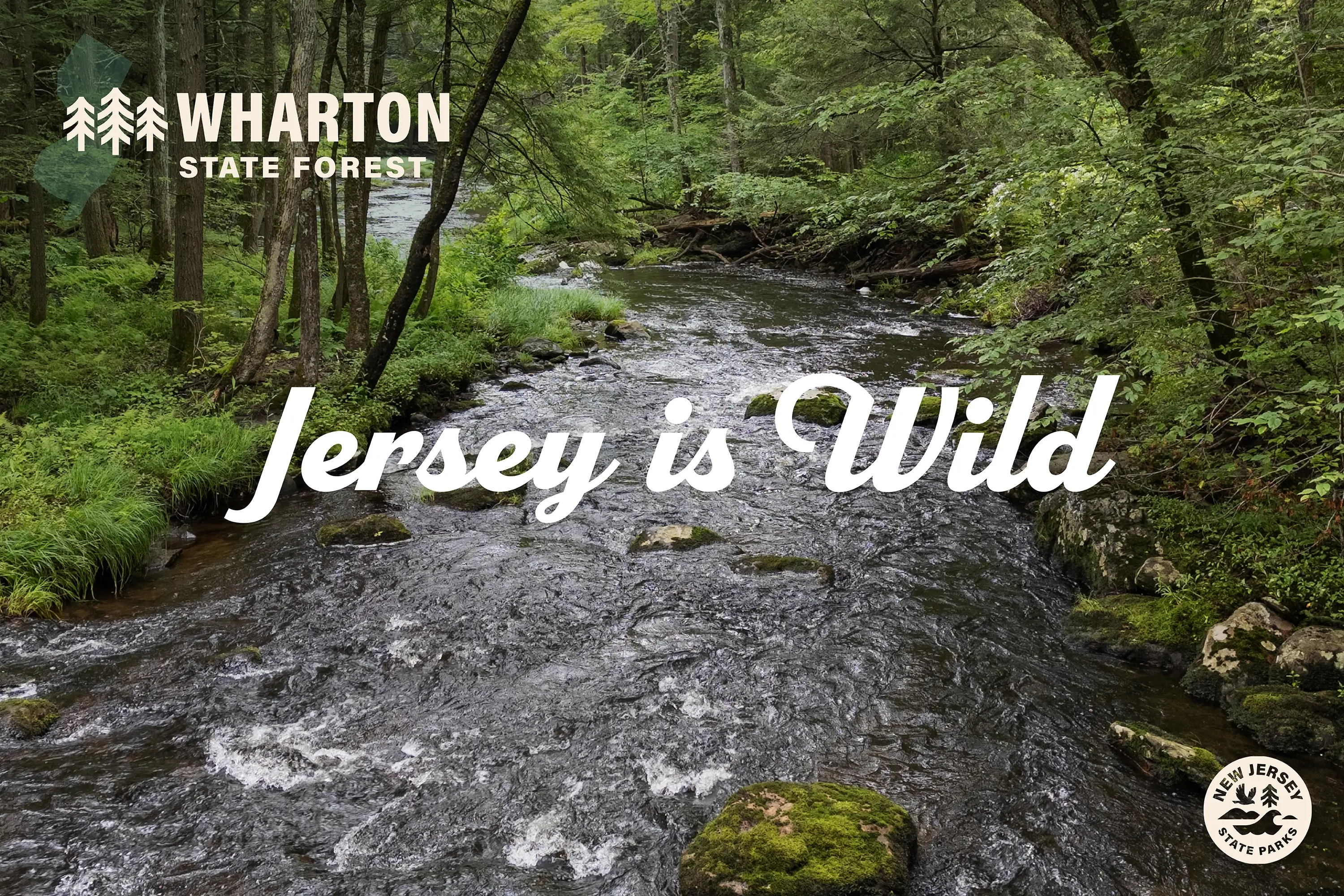
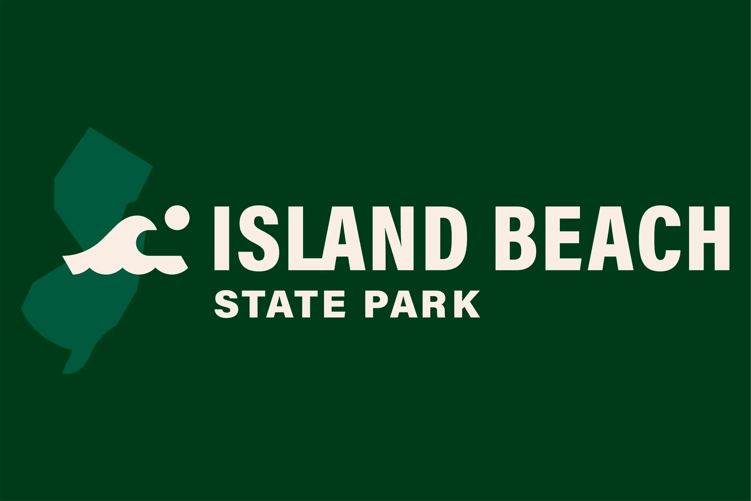
DbD also developed eleven park-specific logos, as well as logos for NJ State Historic Sites and for NJSP celebrations marking America’s 250th anniversary.
Signage
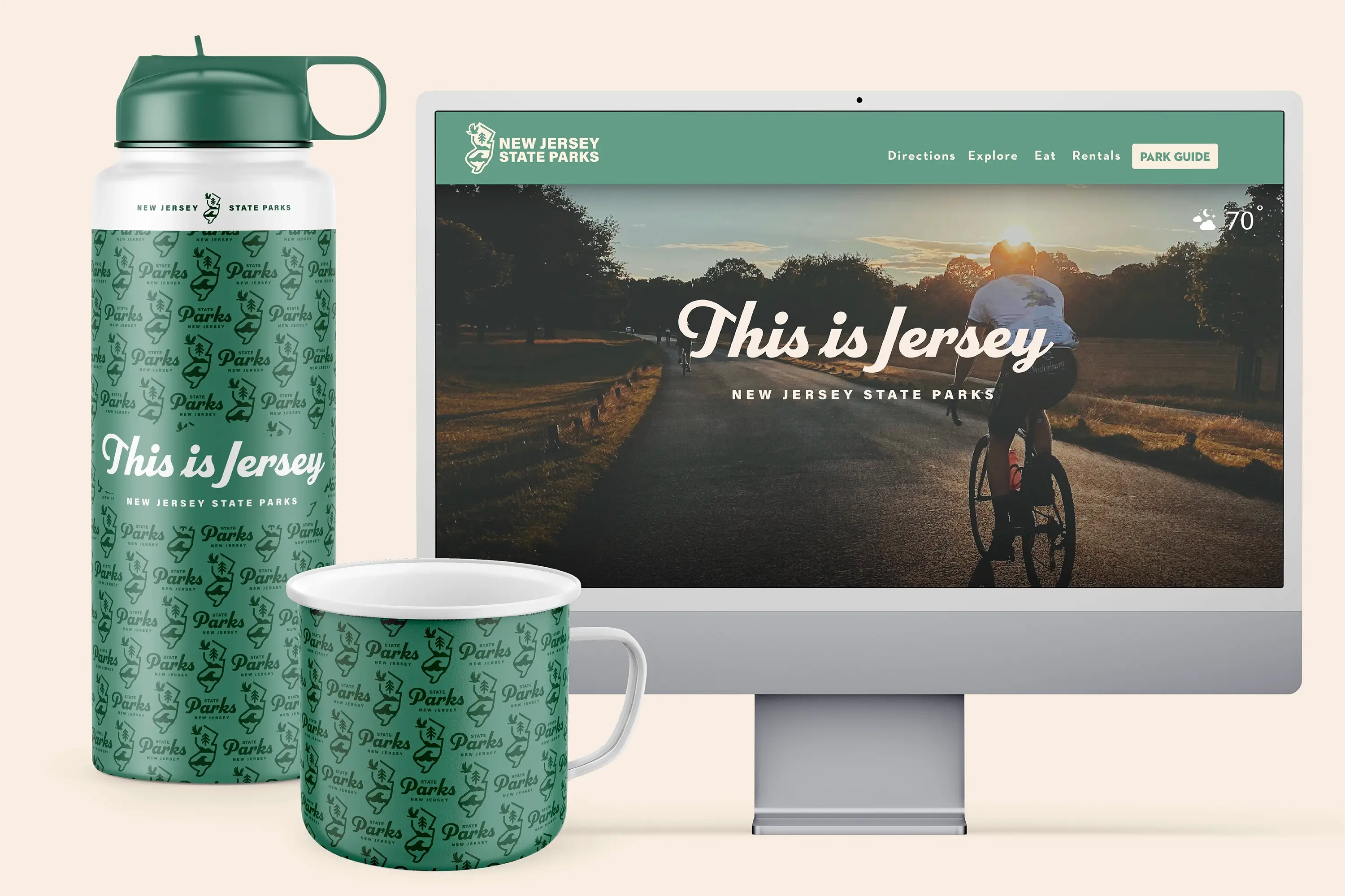
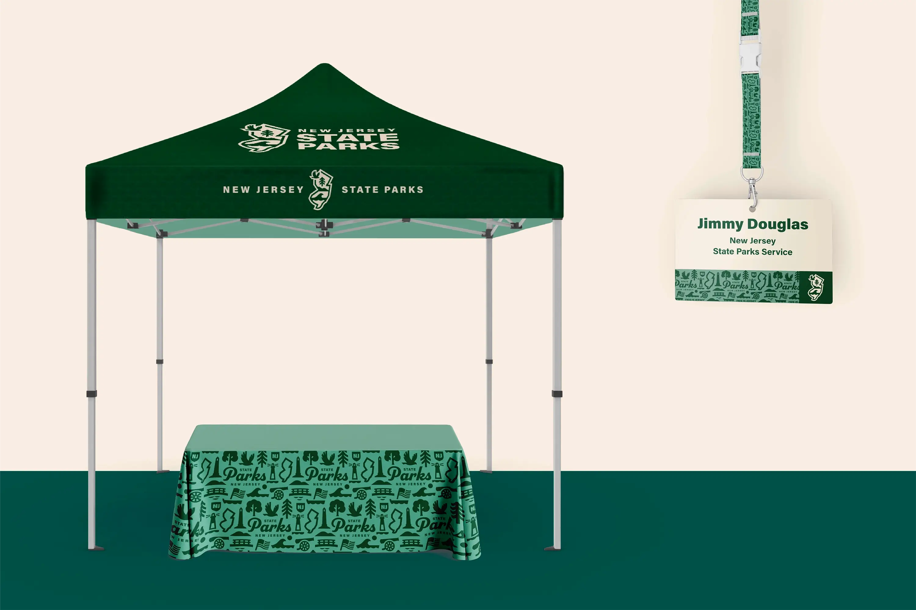
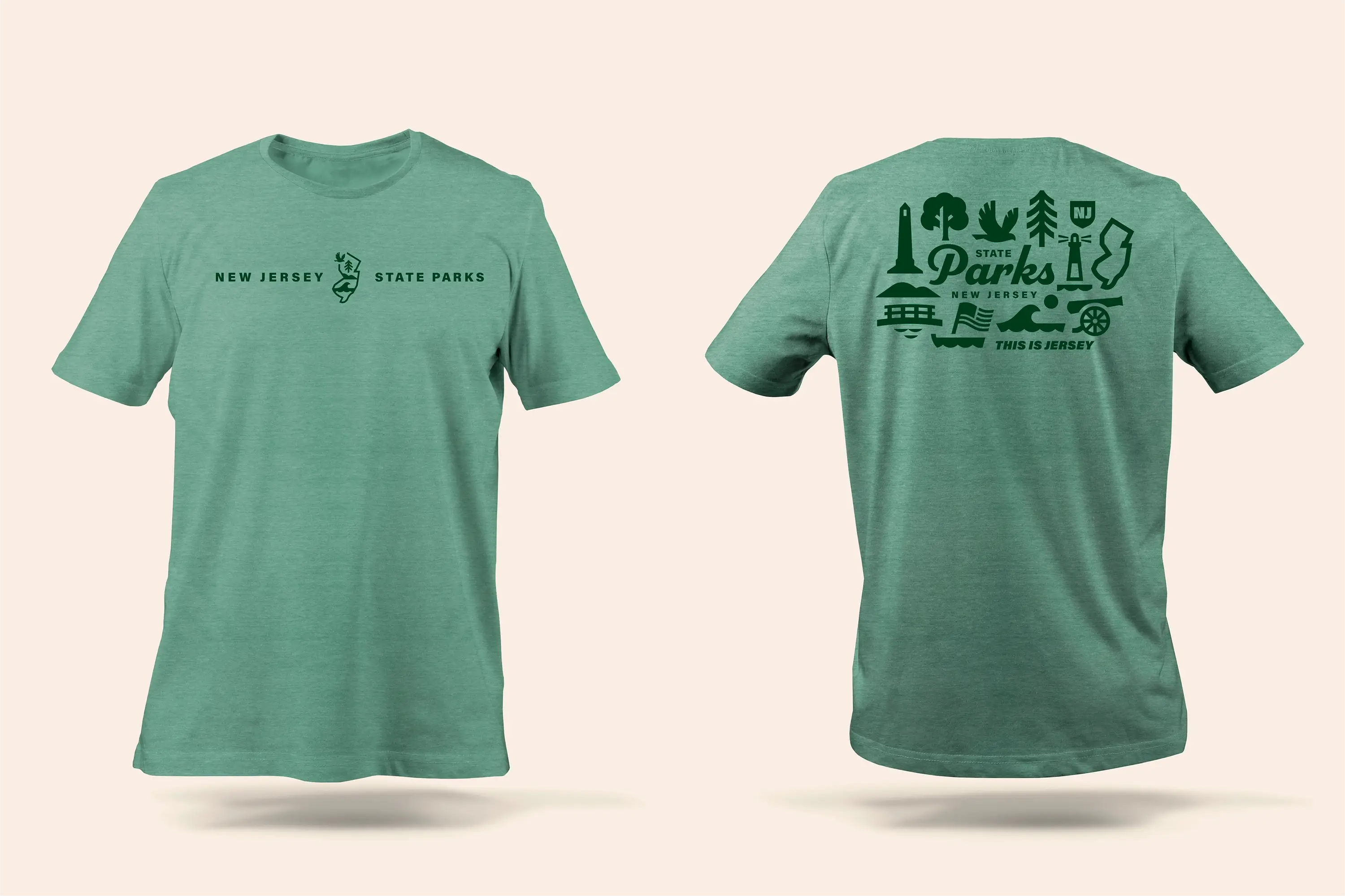
Our signage solutions were designed to be practical and buildable, respecting site-specific constraints and available resources, while ensuring the brand translated seamlessly from digital to physical environments. The result: a cohesive, flexible system that empowered NJSP to launch its new brand with clarity and impact, from gateway signs to trail markers and water bottles to t-shirts, and positions the parks as a key part of the state’s and nation’s heritage.
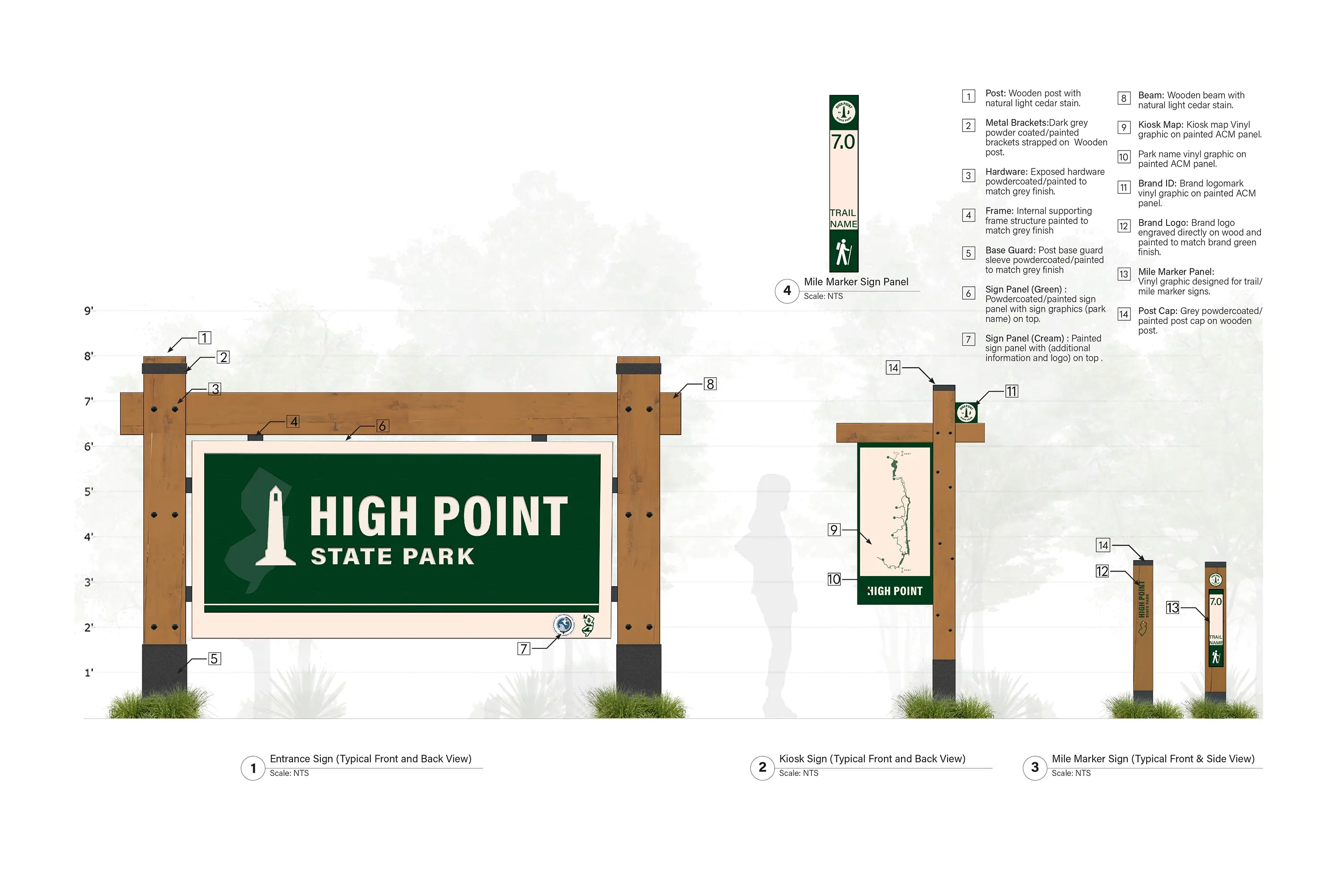
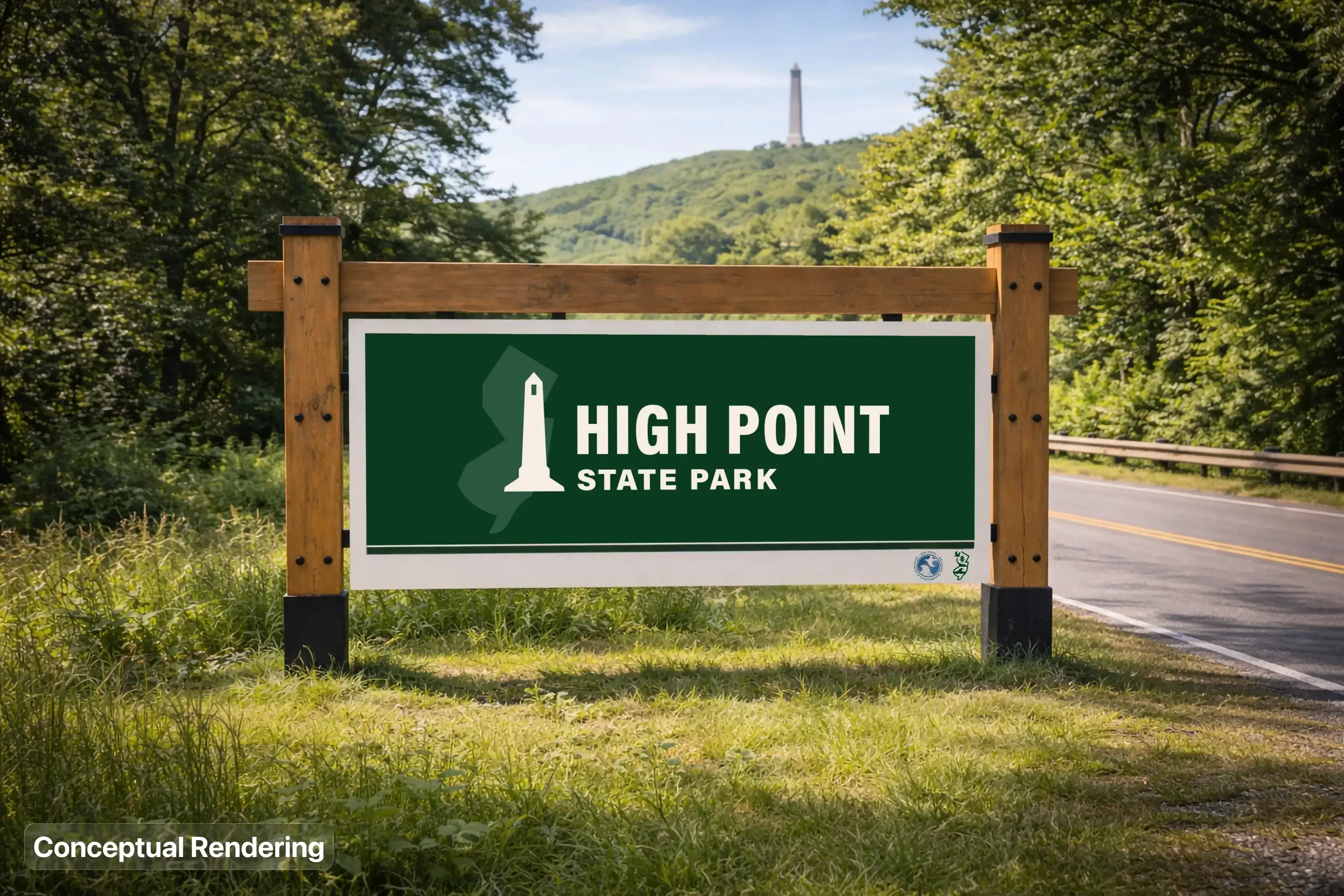
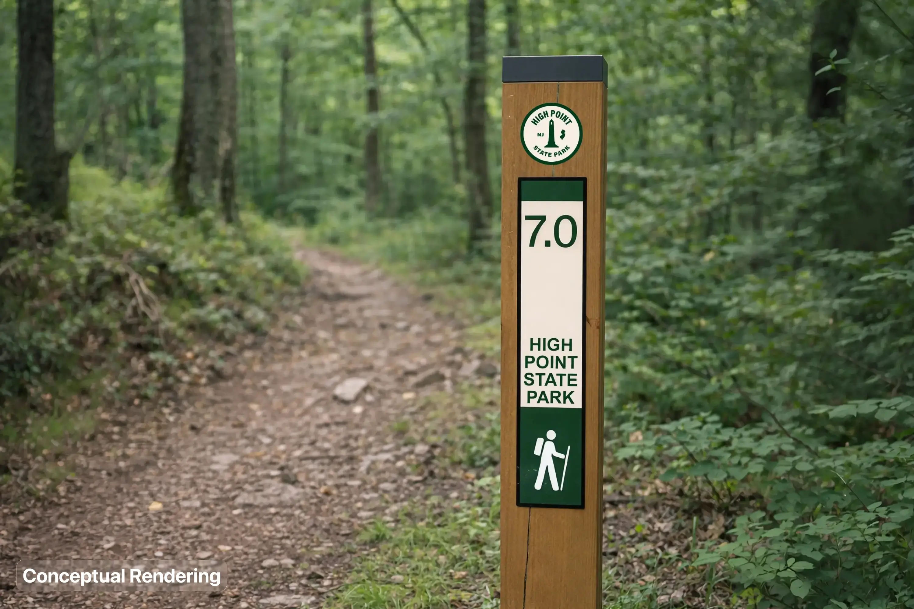
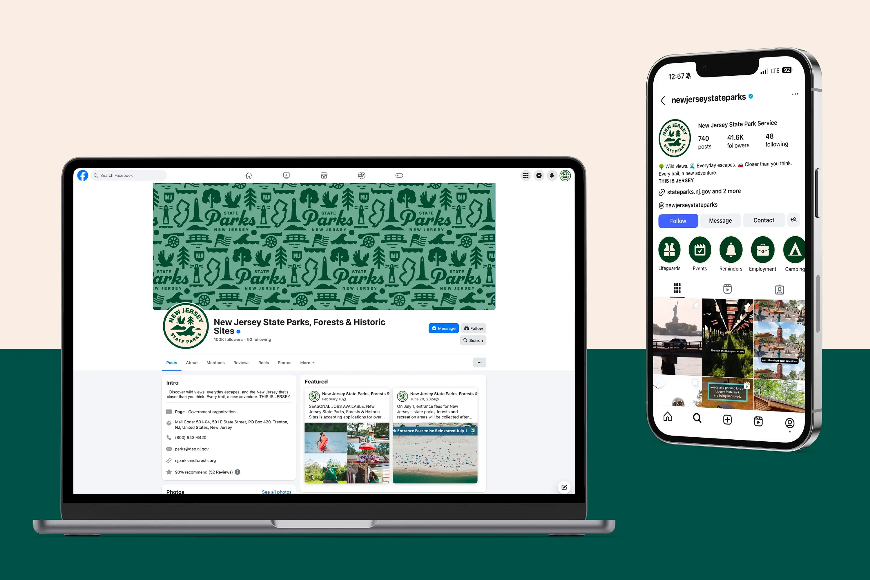
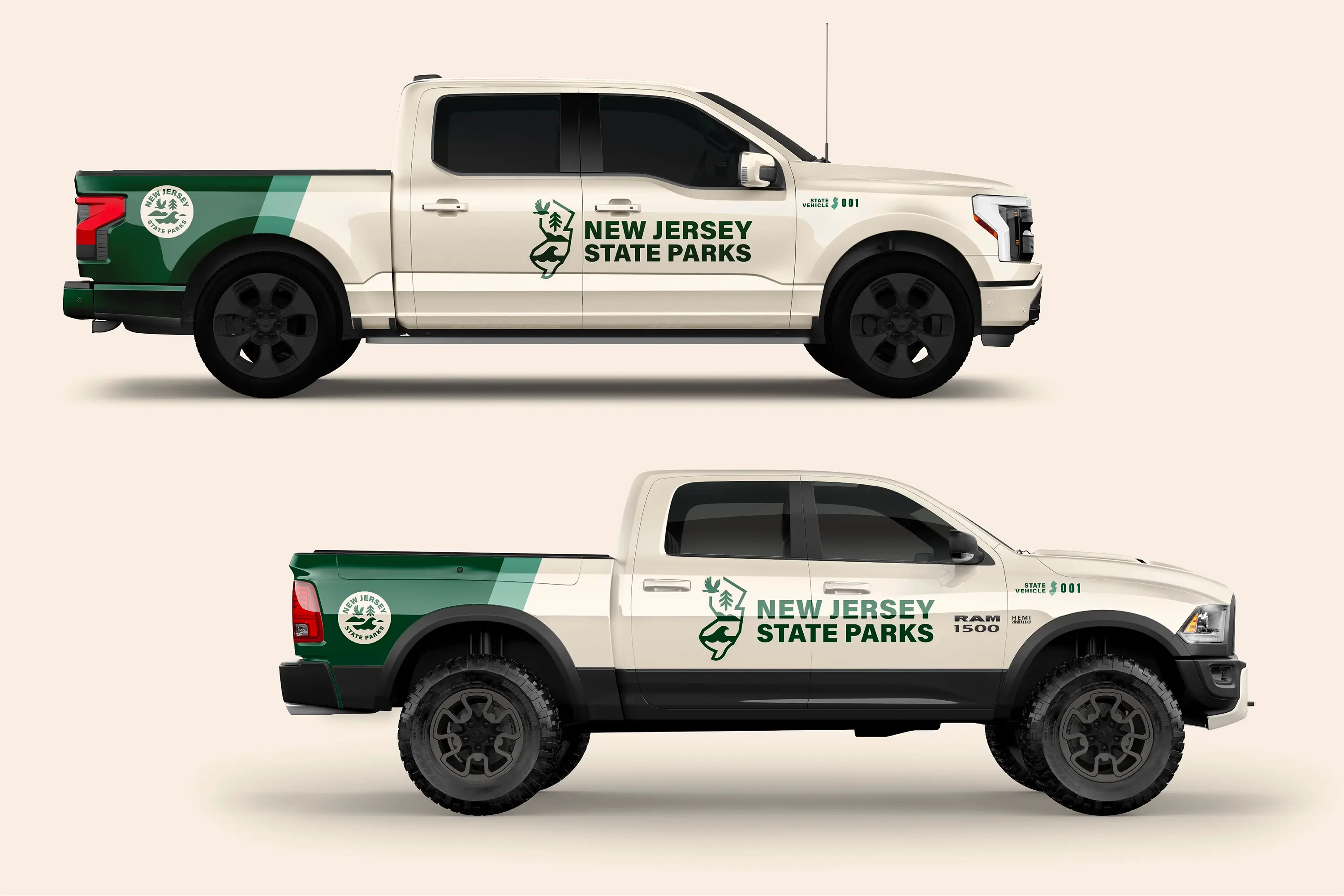
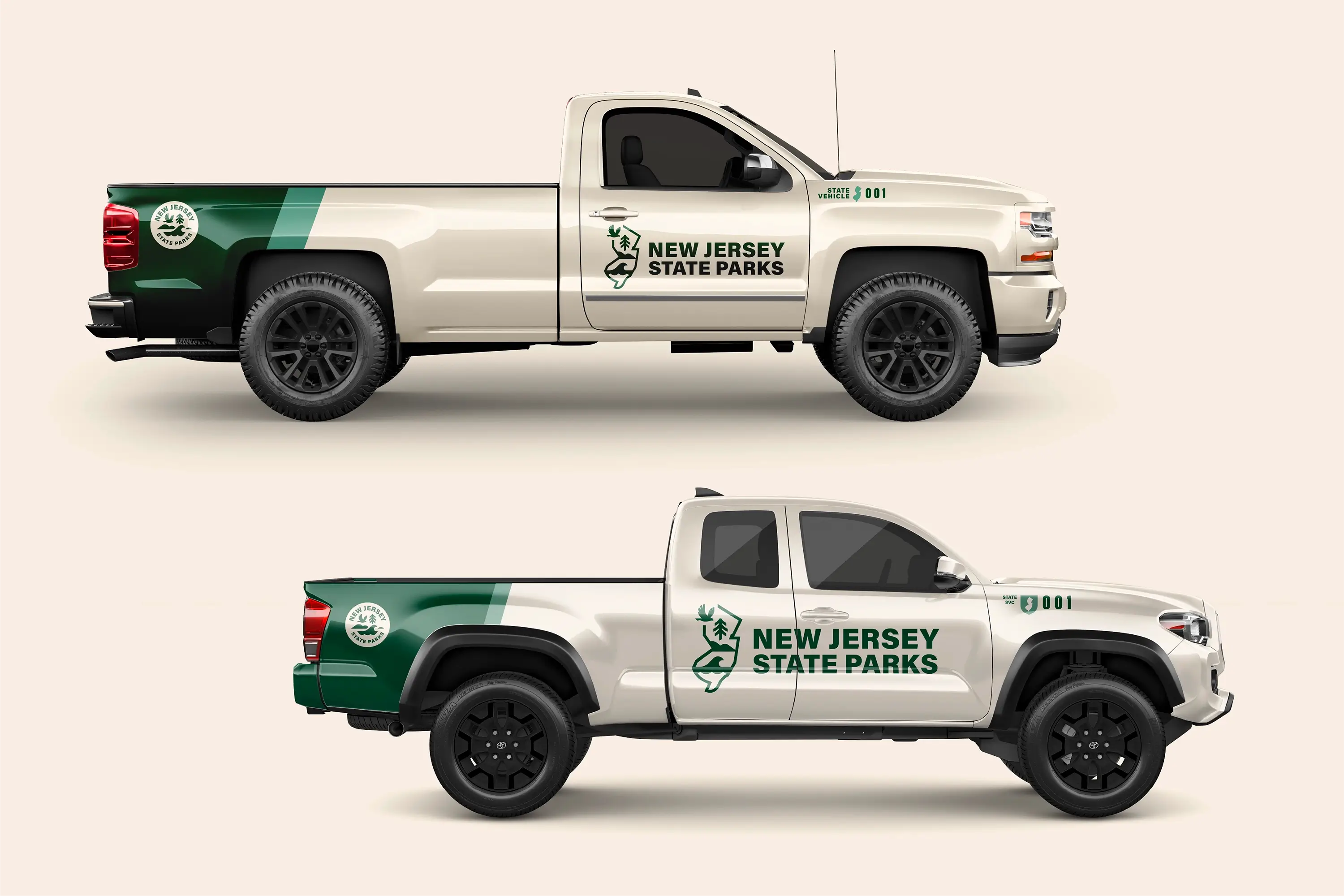
Destination by Design partnered with New Jersey State Parks to lead a statewide rebranding initiative, uniting more than 100 parks, forests, and historic sites under one cohesive visual identity. The project included a refreshed shield-based logo family, individual park brands, a dedicated State Historic Sites brand, and a special mark for NJSP’s America 250 celebration. The result gave New Jersey a unified system that could flex across gateway signage, apparel, vehicles, and digital platforms while still honoring each park’s individual character.
In New Jersey, community branding and wayfinding often go hand in hand, especially for a park system as large and varied as NJSP. Alongside the new visual identity, DbD developed a signage system built to be practical and buildable across sites with very different budgets and physical constraints, from trail mile markers to full entrance signage. That pairing let the new brand carry seamlessly from a park’s digital presence to the signs visitors actually see on the ground.
A strong brand does more than look good. For a public park system, it can reshape how residents and visitors perceive an entire state’s natural resources. NJSP’s rebrand was built to challenge assumptions about New Jersey as the nation’s most densely populated state by presenting its parks as wild, diverse, and unexpectedly pristine, drawing on stakeholder interviews and statewide surveys to ground the new identity in the generational pride that communities already felt for these places.
Visual identity design is the process of creating a cohesive system of logos, colors, typography, and patterns that represents an organization or place across every touchpoint. For a system as large as NJSP, that meant developing a flexible “family of brands,” a shared framework of fonts, colors, and imagery that let each of the eleven featured parks, plus the Historic Sites and America 250 programs, feel distinct while still reading as part of one unified system.
New Jersey’s state park system spans the entire state, from the Atlantic coastline at Island Beach and Barnegat Lighthouse to the ridgelines of High Point and Stokes State Forest along the northern border, with over 100 parks, forests, and historic sites in between. That geographic range, coastal, forested, and historic all at once, was central to the challenge of building one brand flexible enough to represent all of it.