

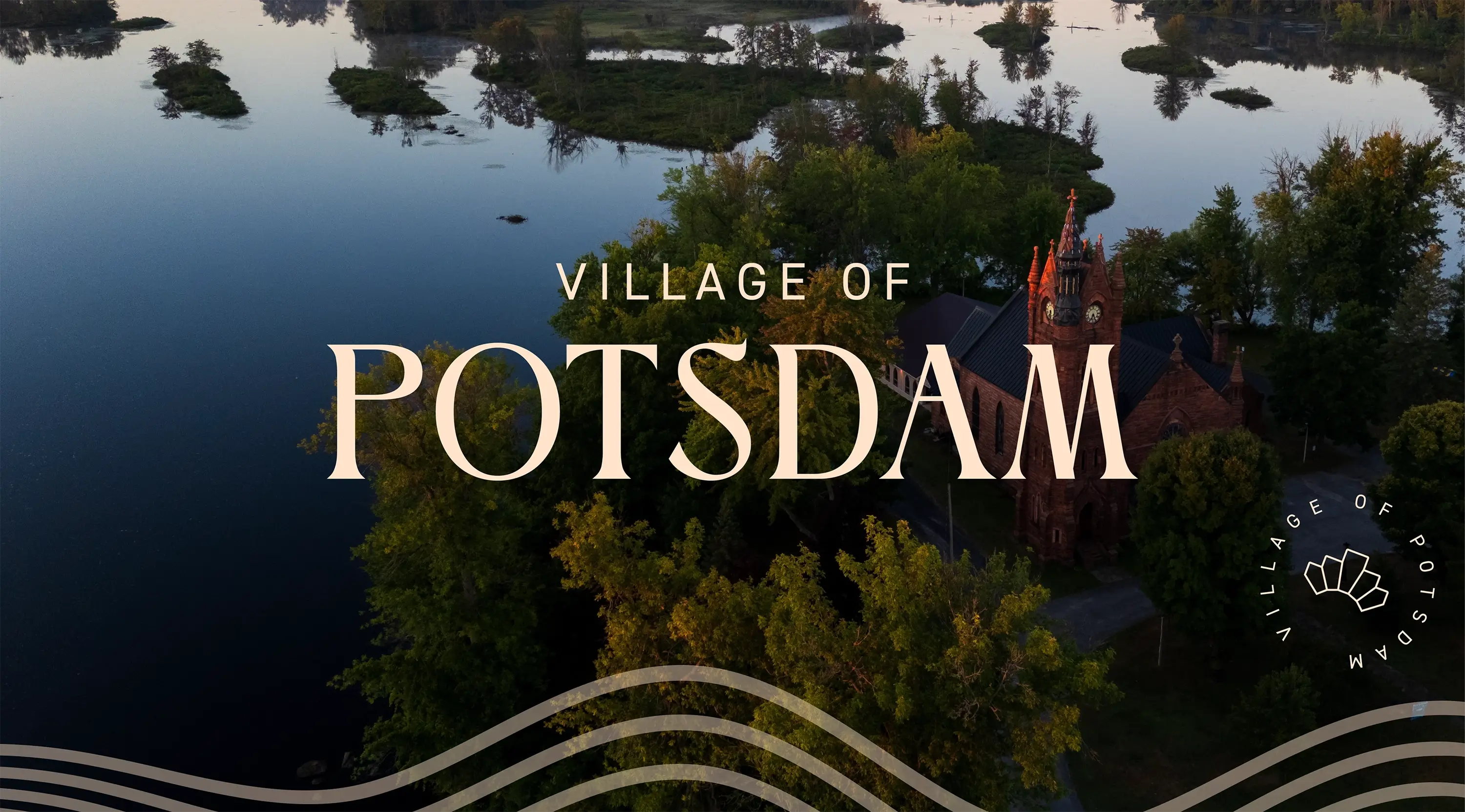
DbD helped the Village create a community brand around the qualities residents value most: learning, creativity, kindness, and a strong sense of place.
Brand Strategy & Positioning
The identity centers on five brand pillars — Learning & Discovery, Creativity & Expression, Welcome & Community Care, Heritage & Sense of Place, and Nature & Environment. Together they capture what makes Potsdam distinct.
This strategy gives the Village a shared foundation for tourism, economic development, and partnership with Clarkson University and SUNY Potsdam — a way to communicate consistently with residents, prospective students & faculty, and visitors alike.
Brand Messaging & Visual Identity
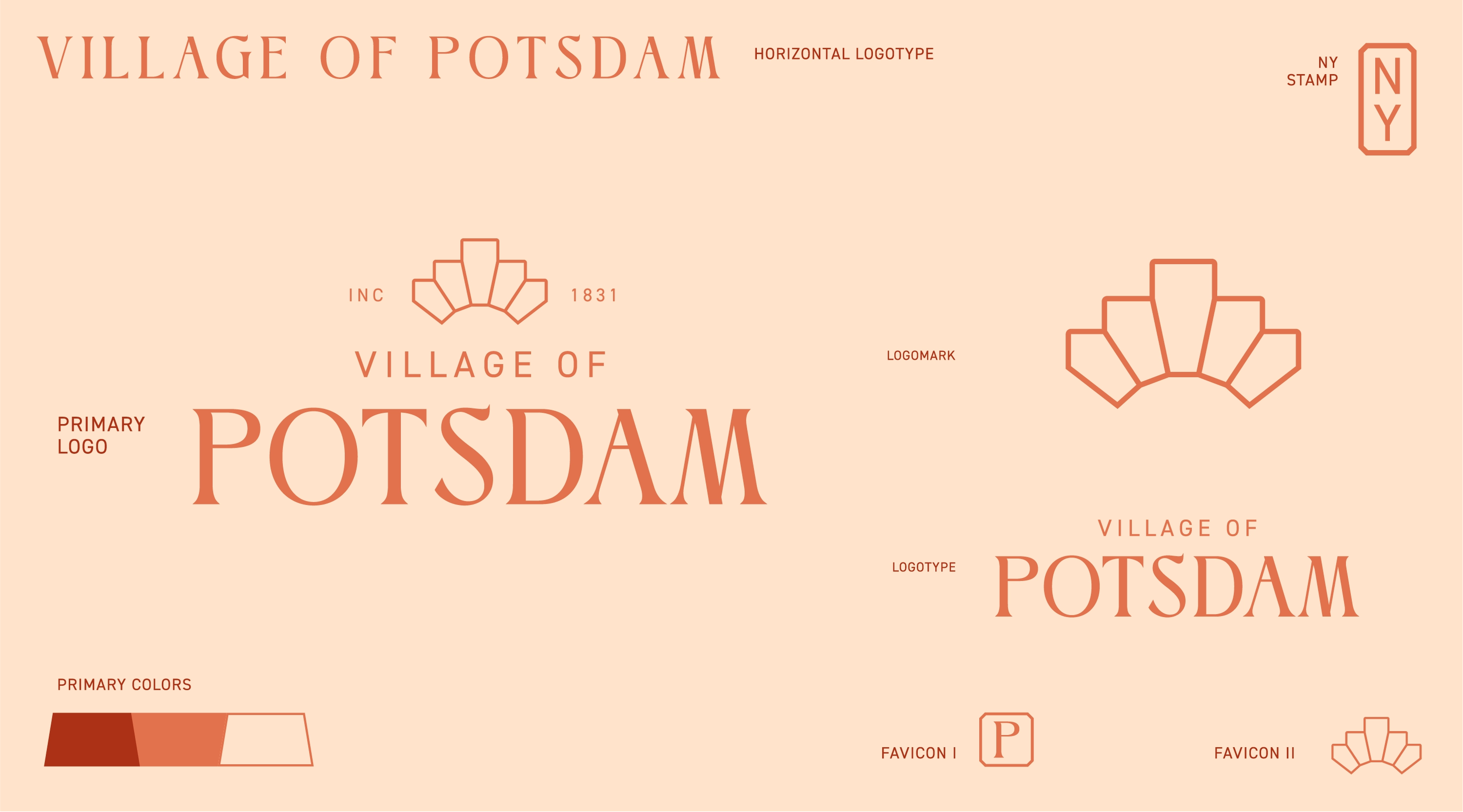
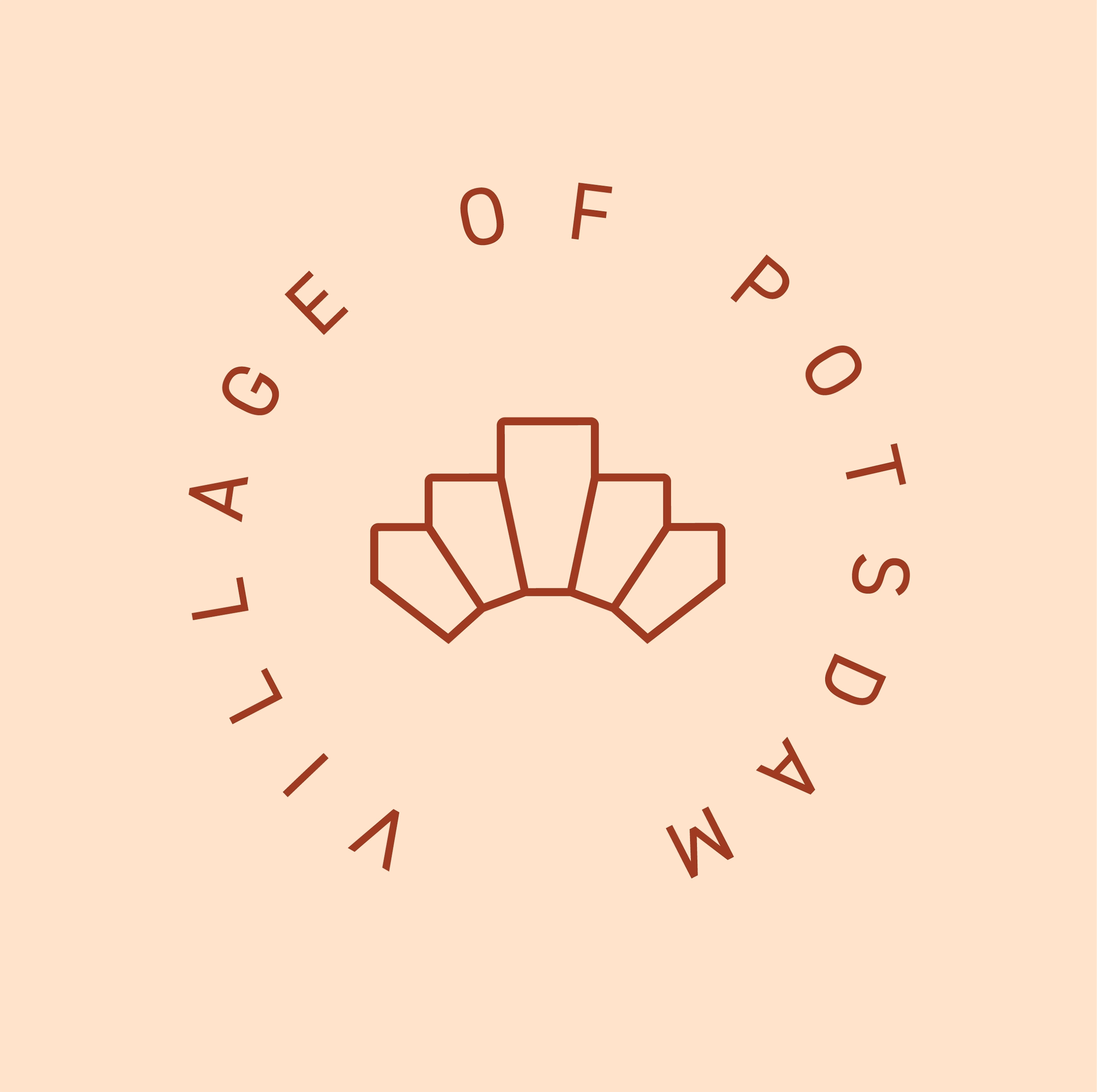
A full identity system took flight, with a primary logotype, emblem, stamp, and favicon marks — built around an arch motif drawn from the Village’s sandstone architecture. Brand messaging was shaped directly from Potsdam’s own positioning: a welcoming, inspiring, and crafted community where people learn, create, and belong.


Icon & Pattern System
Ten illustrative icons represent Potsdam landmarks and cultural touchpoints — from the Civic Center to the Kids Museum — alongside a broader icon pack for everyday wayfinding.

Destination by Design partnered with the Village of Potsdam to build a community brand equal to its character — a place shaped by two academic institutions, a river-carved landscape, and a downtown built from local sandstone. The result gives Potsdam, New York a unified visual identity and voice that residents, students, and visitors can recognize at a glance, whether they’re on campus, along the Riverwalk, or reading the Village’s own communications.
North Country New York communities are increasingly investing in the kind of cohesive branding usually reserved for larger tourism destinations, and Potsdam is a strong example. DbD’s community branding and visual identity work gave the Village a flexible logo system — a primary mark, emblem, stamp, and favicon set — built around a sandstone arch motif that ties the identity directly back to Potsdam’s built environment.
A clear village brand does more than look good — it gives Potsdam a shared foundation for tourism, economic development, and partnership with Clarkson University and SUNY Potsdam. DbD’s brand strategy identified the qualities residents value most — learning, creativity, kindness, heritage, and a strong sense of place — and translated them into a framework the Village can use with confidence across every audience.
Community branding is the process of defining and visually expressing what makes a place distinct, then building a consistent system — logo, color, typography, imagery, and voice — that local government, institutions, and residents can all use. For the Village of Potsdam, that meant translating brand pillars like Learning & Discovery, Creativity & Expression, and Welcome & Community Care into a logo system, icon set, and color palette that feel authentically local rather than generic.
The Village of Potsdam sits in St. Lawrence County in New York’s North Country, along the Raquette River near the Adirondack Mountains and the Canadian border. It’s home to Clarkson University and SUNY Potsdam, and known for its sandstone architecture, four distinct seasons, and a downtown shaped by generations of academic and artistic life.