

Danville wanted to update its identity and needed a new way to engage its residents and welcome visitors. We partnered with the City to create a brand vision that conveys its welcoming, hopeful essence, centered around and symbolized by the Dan river.
Brand
Identity
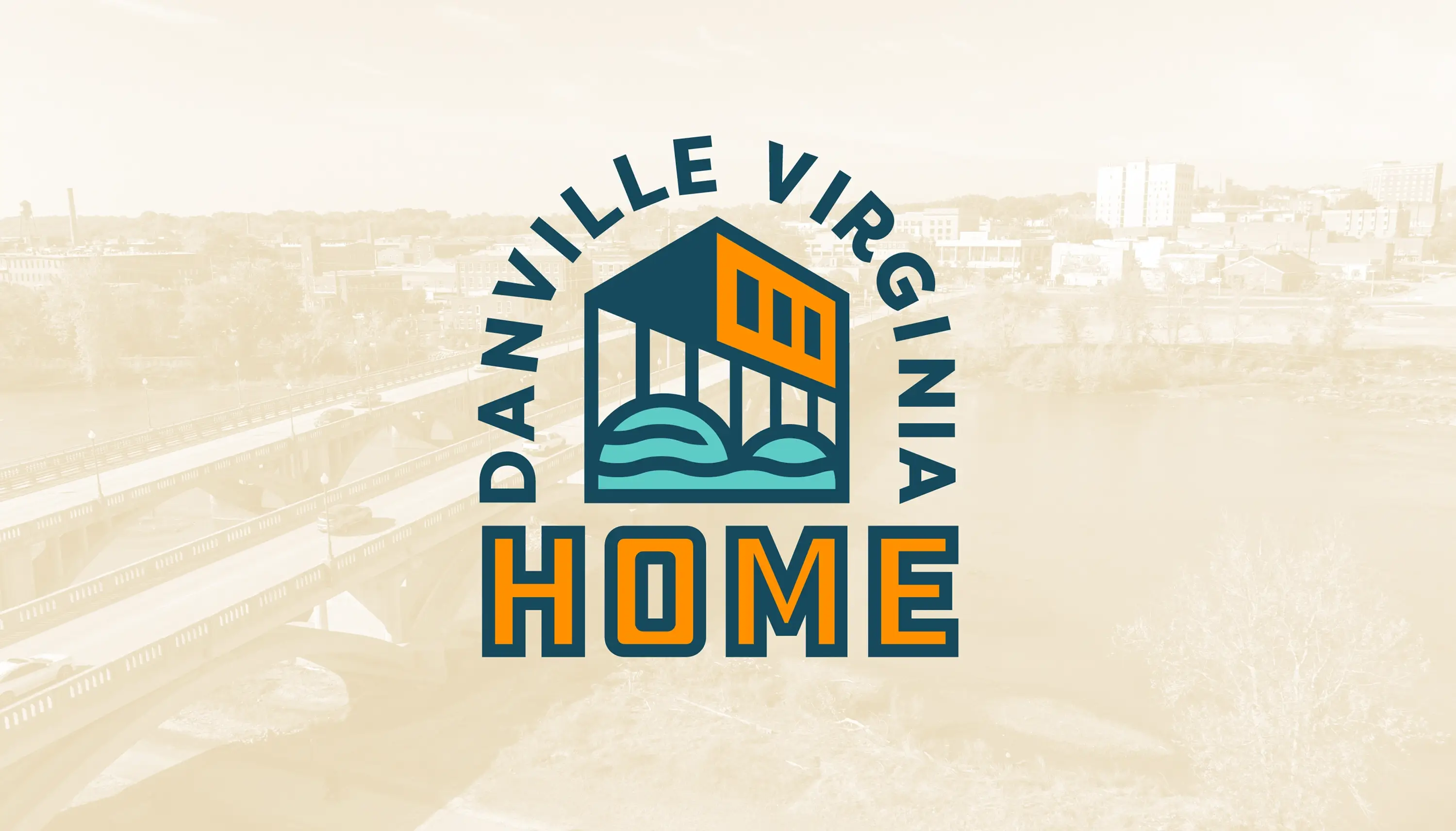
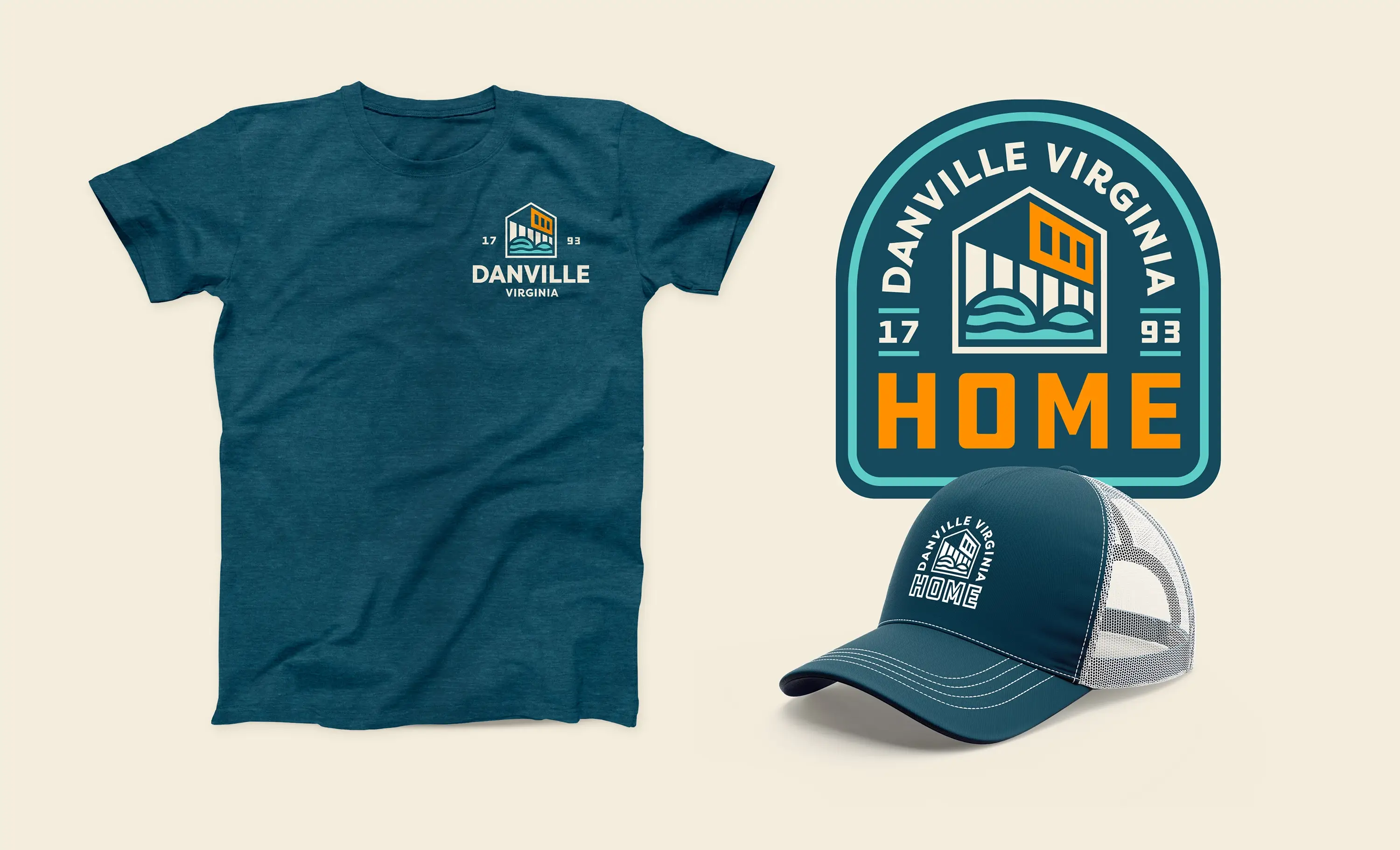
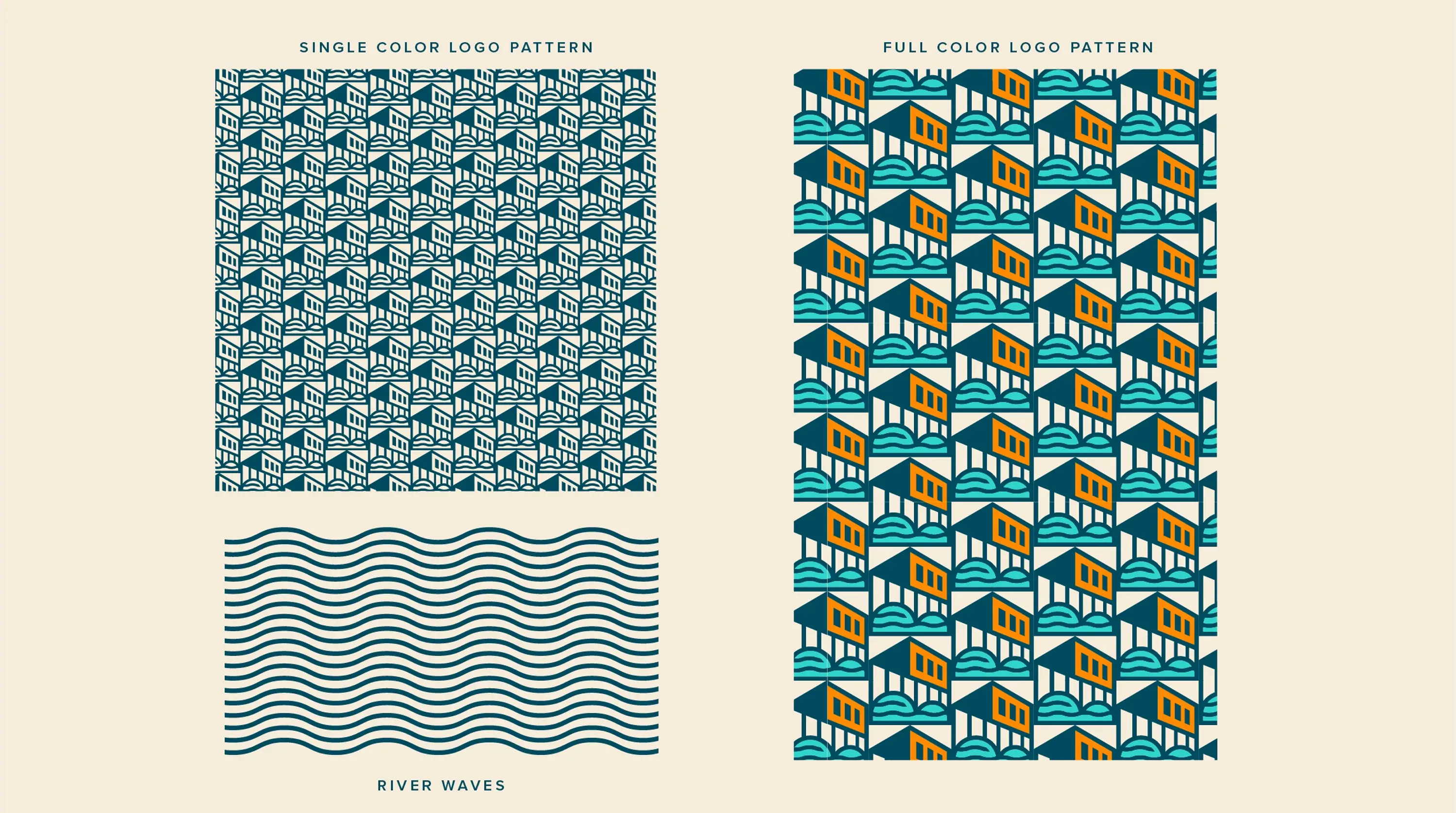
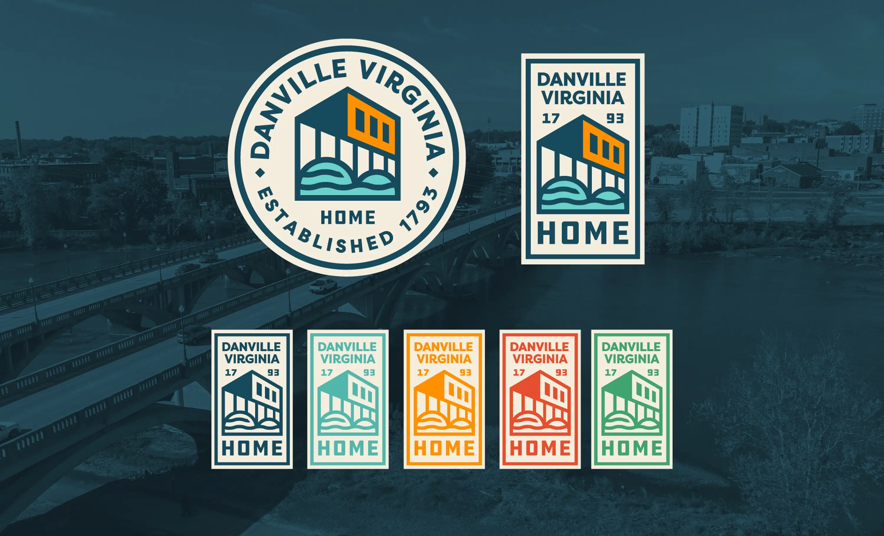
Our new strategy for Danville captures the city’s ever-present feeling and narrative of “home”. The primary element of Danville’s new logo is the city’s iconic bridge that connects its communities, and the Dan river, which both literally and figuratively ties the city together.
Brand
Collateral
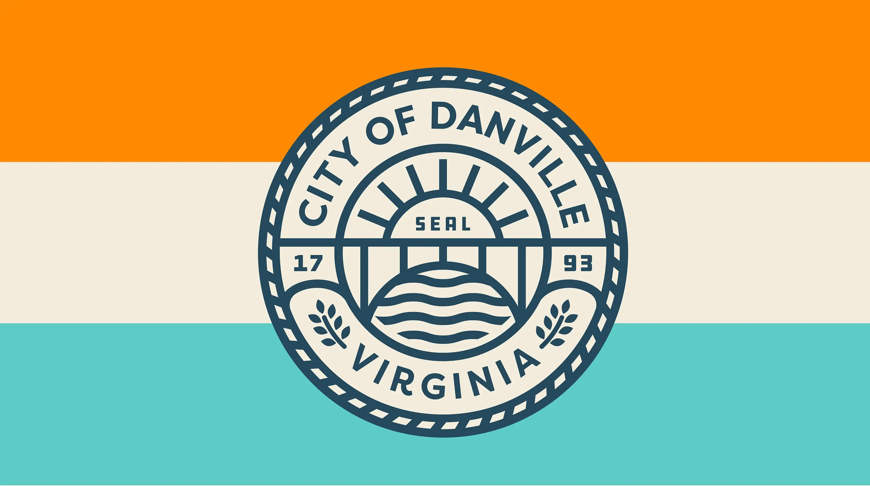
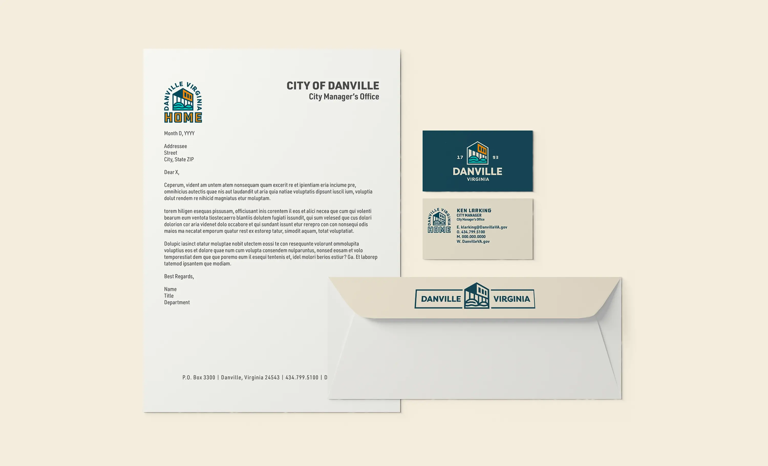
As part of the project, our team redesigned the city seal- its first update since its origin. Also, a new city flag, police cars, fire department badges, and a variety of municipal government collateral was designed and produced.
Community
Engagement
Through our community research and engagement, our team uncovered a profound commitment among locals to fostering a sense of belonging. This, among other factors, led to the very apt tagline: “Feels like Home.” The new identity was adopted and wholeheartedly embraced by all the facets community.
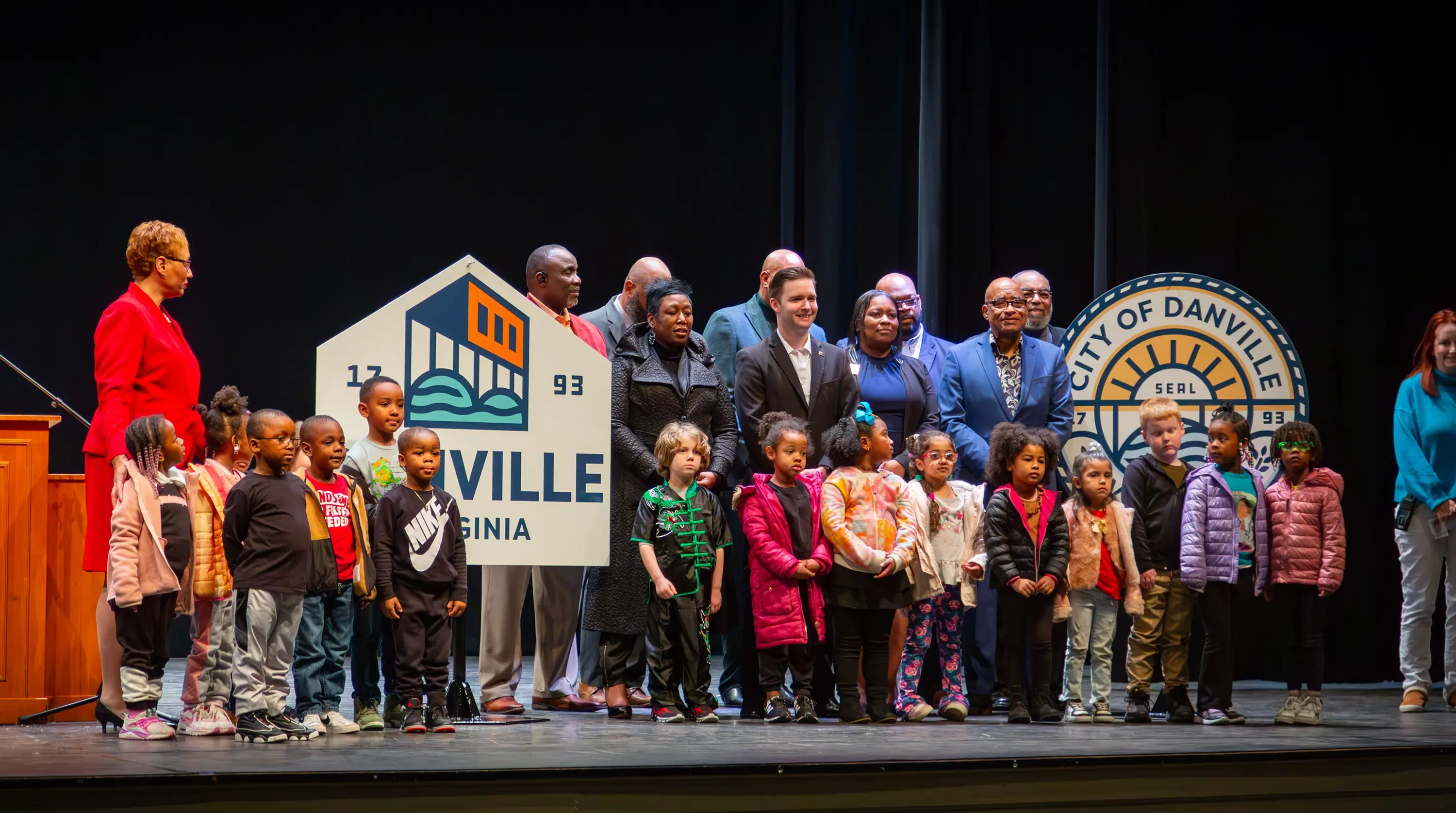
Destination by Design partnered with the City of Danville to lead a top-to-bottom rebrand of the city’s municipal identity, re-envisioning Danville as a welcoming, inclusive river town centered on the Dan River waterfront. The new logo features the city’s iconic bridge connecting its communities, along with a redesigned city seal, its first update since its origin, a new city flag, police cars, fire department badges, and a full suite of municipal collateral.
In Virginia, community branding and destination marketing come together especially well for municipal rebrands, where a city’s official identity has to work across everything from police badges to tourism materials. Danville’s rebrand reflects that scope, extending a cohesive visual identity across municipal government collateral while also supporting the city’s emerging identity as a hub of outdoor recreation along the Dan River.
A municipal rebrand carries different stakes than a typical destination brand. It has to represent every resident, not just visitors. Danville’s brand strategy reflects that responsibility, built on community research and engagement that uncovered a deep local commitment to belonging, leading to the tagline “Feels like Home,” an identity wholeheartedly embraced across every facet of the community.
Community branding is the process of developing a visual identity, brand strategy, and launch plan that captures a place’s character and represents it across every civic and public-facing touchpoint. For Danville, that meant a full municipal rebrand, including logo design, city seal redesign, brand patterns, and a strategic launch plan, all centered on the Dan River as the literal and figurative thread tying the city together.
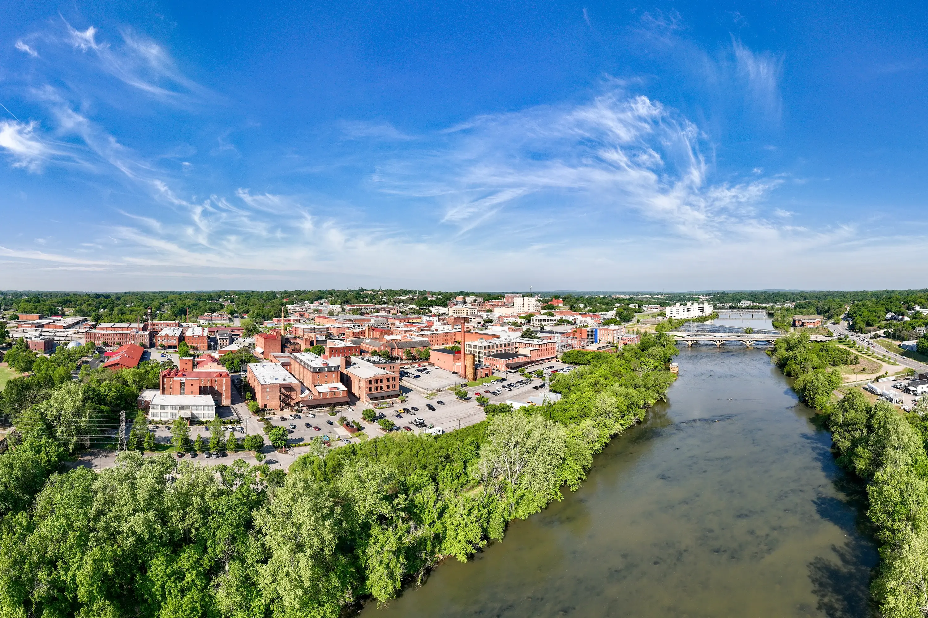
Danville sits in south-central Virginia along the Dan River, a waterfront currently being redeveloped as a new hub of outdoor recreation for the region. The river’s central role in the city’s daily life and geography made it the natural symbolic anchor for Danville’s new municipal brand and its “Feels like Home” identity.